Why do embroidered shapes come out narrower?
Thread is sewn under tension. Each stitch draws the two needle holes at its ends toward each other, and the fabric between them gathers slightly. Across a whole shape, those small pulls add up, so a circle sews out as an oval and a column comes out thinner than the artwork.
The Ink/Stitch satin column documentation puts it plainly: satin stitches pull the fabric together, resulting in a column narrower than you draw. Its fill stitch documentation says the same of fills. Left uncorrected, this leaves thin lettering, fills that stop short of their outlines and gaps between shapes that should touch.
The effect matters most on small elements. Losing 0.2 mm barely shows on a 20 mm fill, but on a 1 mm satin stroke in small lettering it is a fifth of the width. That is why lettering and fine detail get their own compensation values rather than the same setting as the large shapes around them.
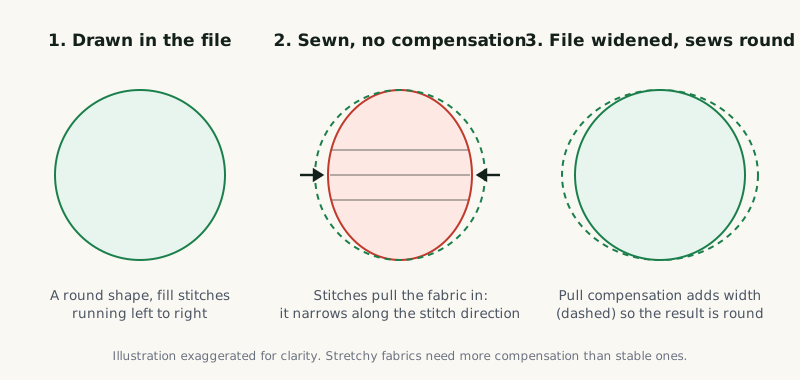
What is the difference between push and pull?
Stitches distort the fabric in two directions at once. Wilcom's guide to push and pull compensation defines them like this:
| Pull | Push | |
|---|---|---|
| Direction | Along the stitch, drawing the sides in | At the ends of columns, pushing outward |
| Effect | Shapes come out narrower | Shapes come out longer than drawn |
| Correction | Widen the shape (pull compensation) | Shorten the ends slightly |
So a satin letter "I" tends to sew thinner and a little taller at the same time. Compensation for pull is a setting in every digitizing program. Push is usually handled by the digitizer drawing the ends of columns short of the artwork.
How does pull compensation differ for satin and fill?
Wilcom notes that satin stitch has the most visible pull effect, drawing in along the sides and pushing out at the ends, especially in long or narrow columns. Tatami fill shows less pull overall but is still affected, especially over large areas.
- Satin: compensation widens each stitch outward from the center of the column. In Ink/Stitch it can be a fixed amount in millimeters, a percentage of the stitch width, or both, and each side can be set separately.
- Fill: compensation extends each row outward from its center, so it acts along the tatami stitch angle, at the ends of each row rather than along the sides the rows run parallel to.
- Running stitch: a single line has no width to compensate, but where it outlines a fill, the fill must be compensated so the two meet.
Choosing between the stitch types is covered in satin stitch vs fill stitch.
How much pull compensation does each fabric need?
Wilcom's help on automatic pull compensation says the allowance is entered in millimeters and varies with the fabric (stretchy, pile), the hooping (tight or loose) and the size of the object (wide or narrow columns). It gives these starting points:
| Fabric or object | Pull compensation (Wilcom starting value) |
|---|---|
| Drills, cotton | 0.20 mm |
| T-shirt | 0.35 mm |
| Fleece, jumper (sweater) | 0.40 mm |
| Lettering | 0.2 to 0.3 mm |
The pattern is what matters: stable wovens need least, stretchy knits more, and lofty fabrics like fleece the most. Wilcom's push and pull guide adds that knits stretch more than wovens, so compensation must be increased, and that every fabric reacts differently, so testing is essential. Caps have their own curve and seam to allow for; see our cap embroidery guide.
Wilcom also notes that underlay, backing and topping reduce the push and pull effect. A well-supported shape needs less compensation. See embroidery underlay types and settings.
What happens with too much or too little compensation?
- Too little: thin satin letters, fills that stop short of their outlines, and small gaps between shapes. Gaps can also be a hooping problem; see why outlines do not line up.
- Too much: shapes that sew wider than the artwork, heavy lettering, and satin edges that look bulged.
- Uneven: one side of a column wider than the other, often where the stitch angle changes.
In practice a digitizer starts from values like those above, sets them per object, and adjusts after a test sew-out on the same fabric and stabilizer the order will use. Shapes that must meet exactly, such as a fill and its outline, are checked first, because that is where too little compensation shows as a gap.
Pull compensation is stored in the working file, not in a machine file like DST, so it cannot be changed properly after export. Our digitizers set it per object for the fabric you name, and a second digitizer checks every file. Order through our embroidery digitizing service, preview the result in the free DST file viewer, and see the other digitizing techniques that work alongside it.
Rather have it digitized for you?
Hand-digitized files from $10 per design, back in 4–8 hours, in every machine format.
Get a free quote →Frequently asked questions
Sources
- Wilcom: understand push and pull compensation
- Wilcom EmbroideryStudio help: apply automatic pull compensation (values by fabric)
- Ink/Stitch: satin column (pull compensation in mm and percent)
- Ink/Stitch: tatami stitch (fill pull compensation)
Sources checked 19 September 2026.